To get the closest brand-color match on an embroidered patch, provide Pantone (PMS) codes and request a physical thread sample or strike-off before bulk production. Screens alone can’t show you true thread color, and even a well-chosen thread number can shift slightly from your on-screen brand palette. Build in a small tolerance for sheen and texture, and you’ll avoid the most common source of patch disappointment.
TL;DR:
- Providing Pantone codes and a physical sample significantly reduces the risk of color mismatches in embroidered patches.
- Thread colors cannot match digital or screen colors exactly due to differences in sheen, texture, and lighting conditions during production.
- Most color discrepancies stem from rushed submissions or lack of precise color reference, not stitching quality.
- Requesting a sample under controlled lighting and documenting approval prevents costly rework and ensures color consistency.
- Deep saturated colors like neon green or rich blues are more difficult to reproduce accurately in thread, requiring manual verification.
Table of Contents
- What Embroidery Color Matching Actually Means
- Preparing Your Artwork and Color Information
- How Manufacturers Match Thread to Your Brand Colors
- Realistic Limits: Colors That Won’t Match Perfectly
- Verifying and Approving Color Before Full Production
- Why Most Patch Orders Fail on Color, Not Craftsmanship
- Get a Color-Accurate Patch Quote and Sample
- Sources
- FAQ
What Embroidery Color Matching Actually Means
Embroidery color matching is the process of translating a brand’s exact color into thread, a medium that behaves nothing like a screen or a printed page. Thread has sheen, twist, and texture that catch light differently depending on the stitch angle, so the same color code can look brighter or duller depending on where it sits on the patch.
That’s why the industry leans on the Pantone Matching System as the shared reference point. Pantone coated guides in particular are the preferred bridge for thread selection, since their glossy finish better approximates how thread reflects light compared to the matte Pantone options. A brand’s logo built in RGB or CMYK has to be converted to a PMS equivalent before anyone can talk about matching it to actual embroidery color.
Here’s the catch buyers rarely hear until it’s too late: not every Pantone shade has a perfect thread twin. Thread manufacturers cross-reference PMS numbers to their closest physical spool, but “closest” and “identical” aren’t the same word, and that gap is exactly where a lot of patch orders go sideways.
Preparing Your Artwork and Color Information
The single biggest lever you control before an order ever reaches a machine is what you hand over at the start. Vague files and screen colors force digitizers to guess, and guesses cost you a second production run.
Give your embroidery patch color scheme the best shot at accuracy with these steps:
- Provide Pantone (PMS) codes, not RGB or CMYK values. PMS is device-independent, which means it reads the same on paper as it does on a spec sheet, and it’s what lets a digitizer cross-reference your brand color to an actual thread color.
- Supply vector artwork in AI, EPS, or PDF format, with each shape labeled by its PMS swatch. Flattened JPEGs strip out the color data that makes precise matching possible.
- Send a physical sample if you don’t have PMS codes on hand. A fabric swatch, a printed card, even a painted panel gives the production team something real to hold next to a thread card, rather than a monitor rendering that may not match your own screen.
- Name your canonical brand color when your style guide has drifted over the years. Plenty of companies discover mid-order that their website uses one blue and their signage uses another. Tell the manufacturer which one is the real brand standard.
The tighter this packet, the less back-and-forth you’ll need later, and the closer your first strike-off lands to your logo.
How Manufacturers Match Thread to Your Brand Colors
Once your files land on a production floor, matching color for embroidery becomes a physical, hands-on process rather than a software calculation. Pantone formula guides act as the neutral middle ground, but the real decision happens against a thread color card holding actual windings of thread, not printed swatches of thread.
The typical workflow runs like this:
- Convert the brand color to its PMS equivalent, using the artwork you supplied or, absent that, the closest available reference from your samples.
- Cross-reference that PMS number against a manufacturer’s thread cross-reference chart, which maps thousands of PMS codes to specific thread spool numbers from suppliers like Madeira.
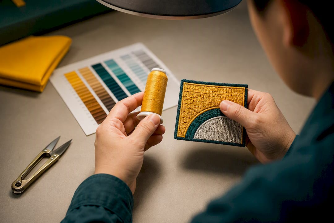
- Pull the physical thread card and hold it against the Pantone chip under controlled lighting, since screens and printers can’t simulate thread color reliably.
- Escalate to a customer-service-mediated decision when no official cross-reference exists. A trained eye picks the nearest thread by hand and flags it for your approval before stitching.
Lighting matters more here than most buyers expect. A shade that reads correctly under warm shop lighting can look noticeably different in daylight, a phenomenon called metamerism. That’s why serious production floors inspect thread against Pantone chips under a standardized light source, often around 4100°K, which mimics cool white daylight conditions and keeps the comparison honest.
Pro Tip: Ask whether your manufacturer keeps thread cards on hand for the specific thread brand they stitch with. A generic PMS chart is useful, but a card with the actual spools they’ll load into the machine is the tool that actually prevents surprises.
Realistic Limits: Colors That Won’t Match Perfectly
Some colors simply sit outside what thread can reproduce, no matter how good the cross-reference chart is. Deep saturated blues, neon greens, and highly saturated oranges are the usual troublemakers, since dyed thread has a narrower color gamut than a backlit screen or a four-color print process.
Sheen compounds the problem. Two threads carrying the exact same dye lot can look different once stitched, because the direction of the stitch changes how light bounces off the fiber. That means even a “correct” thread number, verified against a Pantone chip, might read slightly lighter or darker once it’s actually embroidered into your logo at scale.
This is where manual comparison earns its place in the process. Automated cross-references get you 90 percent of the way, but a trained technician holding a spool next to your artwork under proper light is what closes the remaining gap. Expect the finished patch to closely match your brand color, not necessarily be pixel-perfect against a digital file, and build your approval process around that reality rather than fighting it.
Verifying and Approving Color Before Full Production
The cheapest insurance in the entire process is a sample. Requesting a complimentary strike-off before committing to a bulk run costs you a few days of turnaround and saves you from reordering hundreds of patches in the wrong shade.
When your sample arrives, inspect it properly:
- View it under consistent lighting, ideally the same 4100°K standard or clear natural daylight, and avoid approving color under yellow-tinted indoor bulbs.
- Compare it against both a Pantone fan deck and the manufacturer’s thread card, since matching thread color reliably means checking two references, not one.
- Photograph the approved sample and confirm it in writing, so there’s a documented reference if a later production run drifts.
- Agree on tolerance in advance. A slight sheen difference on a curved letter is normal; a visibly wrong hue across the whole patch is not, and setting that line early avoids disputes later.
Verification against a controlled reference is standard practice in professional textile production precisely because eyeballing under random light leads to approvals that don’t hold up once the patches ship. A sample cycle typically adds a few days to your timeline. Reworking a full bulk order because nobody checked the color first adds weeks, plus the cost of materials you can’t reuse.
Why Most Patch Orders Fail on Color, Not Craftsmanship
Most color complaints heard by manufacturers aren’t stitch quality problems. They’re expectation problems, set the moment a buyer approved a design on a laptop screen and assumed thread would behave the same way pixels do.
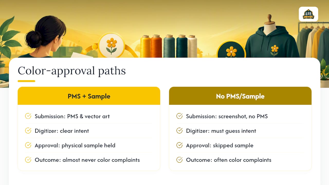
The uncomfortable truth is that a lot of “bad color match” feedback traces back to a rushed submission, not a production error. A logo file with no PMS reference, sent as a screenshot rather than vector art, forces a digitizer to guess at intent. Guessing under deadline pressure is where mismatches creep in, not in the stitching itself.
Leeembroidery specializes in custom patch manufacturing, including embroidered, PVC, and leather patches, and treats color accuracy as a craftsmanship issue as much as a technical one. Complimentary samples and rapid quote turnarounds can help because color approval works best when a buyer can hold a physical piece before committing to a full run. Experience across different industries shows that buyers who supply PMS codes and approve a sample first almost never come back with color complaints, while buyers who skip that step often do.
— Bilal
Get a Color-Accurate Patch Quote and Sample
There’s a reason the checklist in this article keeps pointing back to samples and PMS codes: they’re the two things that actually prevent rework. Some manufacturers build their process around these principles, offering rapid quote turnaround and complimentary samples so customers can confirm brand color in hand before committing to bulk production.

If your logo needs to be converted into a stitch-ready file first, the embroidery digitizing service covers left chest, cap, and jacket back formats, so your artwork arrives production-ready with the right color references attached. From there, browse embroidered patches to see backing, border, and sizing options, or check PVC rubber patches and woven patches if your project calls for a different material. Request your free sample and a no-obligation quote today, and get a physical piece in hand before you commit to a single unit of your run.
FAQ
What Is the Best Color Reference for Embroidery Orders?
Pantone (PMS), specifically the coated formula guide, is the industry standard because it’s device-independent and lets manufacturers cross-reference your brand color to an actual thread number. RGB and HEX codes describe light on a screen, not dyed thread, so they don’t translate directly.
Why Doesn’t My Logo Color Look Exactly Right on the Finished Patch?
Thread has sheen and texture that change how light reflects off it, so even a correctly chosen thread can read slightly different from a flat digital color. Screens and printers can’t fully simulate thread color, which is why a physical sample matters more than a digital preview.
Does Leeembroidery Offer Free Samples Before Bulk Production?
Yes, Leeembroidery provides complimentary samples so you can approve color and quality in hand before committing to a full order. You can request one along with a rapid quote through the custom patches page.
What Should I Send if I Don’t Know My Pantone Code?
Send vector artwork if you have it, plus a physical sample such as a printed card, fabric swatch, or product with the color already applied. Production teams can match against a real object even without an official PMS number, though it takes an extra verification step.
How Much Color Variation Is Normal Between the Sample and the Final Batch?
A small difference in sheen or a slight shift under different lighting is normal and expected in embroidery. A visible hue shift across the whole design is not, which is why agreeing on tolerance during sample approval under consistent lighting matters before you approve bulk production.