Small text on patches is readable at 5 to 5.5 millimeters for all caps and about 6.2 millimeters for mixed case, according to industry minimums. We recommend 60-weight thread for most small lettering and always suggest a physical sample before any bulk order. Below those heights, embroidery starts to lose clarity fast, and you may want to look at woven, printed, or PVC patches instead.
TL;DR:
- Stable fabrics such as twill, denim, and nylon support smaller lettering; fleece, towels, and stretchy knits need larger type or tackdown stitching.
- Use bold, geometric sans serif letters with open counters and extra spacing; avoid fine serifs, script, and tight gaps that stitches can close.
- Near 3 millimeters, 75 weight thread reduces bulk but needs smaller needles and tighter spacing, while raising trim counts and stitch pickup risk.
- For dense, tiny text or a tight budget, woven and printed patches often preserve detail better per dollar; PVC also keeps sharp molded lettering.
- Judge the stitched sample at its real viewing distance, checking for clumped strokes, blurred edges, and color bleed that a digital proof cannot reveal.
Table of Contents
- Minimum Sizes and Stroke Rules You Need to Know
- Which Fonts Digitize Best at Small Sizes
- Thread Weight, Needle Size, and Stitch Settings That Matter
- How Fabric and Backing Change Your Size Minimums
- Design and Digitizing Checklist for Small Text
- Choosing the Right Patch Method for Tiny Text
- Testing Your Patch Before You Commit to a Full Run
- Placement and Care That Keep Small Text Legible Longer
- Why Our Process Is Built Around Small-Text Accuracy
- A Few Rules I Always Follow for Tiny Text
- Get Small Text Right With a Free Sample From Us
- FAQ
- Sources
Minimum Sizes and Stroke Rules You Need to Know
Embroidery has physical limits that no digitizer can stitch around. A needle punching thread into fabric needs a minimum amount of space to form a clean, legible letter, and going below that space turns crisp type into a blurry knot of thread.
The widely cited minimums are about 5 to 5.5 millimeters for all-caps lettering and roughly 6.2 millimeters for mixed-case text, with a minimum stroke width near 0.6 to 0.66 millimeters, according to small lettering guidance. Mixed case needs more room because ascenders and descenders (the parts of letters like “l” and “p” that stick up or down) add vertical complexity that all-caps text doesn’t have.
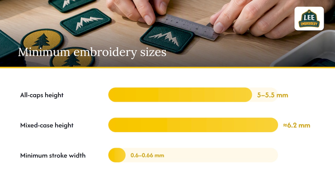
A letter stroke thinner than roughly 0.6 millimeters tends to collapse into surrounding stitches, according to industry sizing data, which is why stroke width matters as much as overall letter height.
These numbers shift depending on what you’re stitching on:
- Low-sink fabrics like twill, denim, and nylon let letters sit closer to their minimum size because the stitches don’t sink into the weave.
- High-pile or stretchy fabrics such as fleece, towels, and pique push minimums higher unless you add tackdown stitching to stabilize the surface.
- Tight, stable weaves generally outperform loose or textured fabrics for any text under 6 millimeters.
Micro lettering in the 3 to 4 millimeter range is possible, but it forces trade-offs. You’ll likely need a finer thread, simplified letterforms, and tighter digitizing tolerances, and even then, viewing distance and fabric choice determine whether it actually reads as text or just a dense texture.
Which Fonts Digitize Best at Small Sizes
Not every typeface survives the trip from a design file to a stitched patch. Fonts built for print often fall apart at small embroidery sizes because thread can’t replicate fine serifs, thin hairlines, or tightly closed letterforms.
- Choose fonts with open counters. Letters like “a,” “e,” and “o” need visible interior space so the stitches don’t fill in and blur the shape.
- Pick a single-storey “a” over a double-storey one. The simpler form holds up better once it’s reduced to a handful of stitches.
- Avoid hairline strokes and tight serifs. Both disappear or clump at small scale, turning crisp letters into smudges.
- Favor condensed or geometric sans-serif styles with bold, even strokes. These typically outperform decorative, script, or brush fonts, which rely on fine detail that embroidery can’t reproduce below a few millimeters.
- Increase letter spacing (tracking) before digitizing. Tight kerning that looks fine in a vector file can cause adjacent stitches to merge once thread adds bulk to each letter.
- Simplify curves where possible. Overly ornate letterforms add stitch complexity without adding legibility at small sizes.
The common thread across all of these rules is bulk management. Thread has physical thickness, and every curve, serif, or tight gap is a place where that thickness can work against you. A clean, bold, geometric letterform gives the needle fewer opportunities to fail.
Thread Weight, Needle Size, and Stitch Settings That Matter
Thread weight is the single biggest lever for small-text clarity, and it’s often the one buyers never think to ask about.
A 60-weight thread is the standard choice for small lettering around 4 to 5 millimeters tall, since it produces fine, well-defined stitches without adding excess bulk, according to AMANN’s small embroidery guidance. We typically pair this with a thread type built for workshop conditions that holds up through repeated washing and wear.
For micro lettering around 3 millimeters or smaller, a 75-weight thread (such as Serafil fine 300) is the better fit, particularly on lightweight woven fabrics where bulk is the enemy. A 100-weight thread is reserved for ultra-fine detail work on delicate fabrics, where even 75-weight would overwhelm the design.
60-weight thread is the recommended standard for lettering in the 4 to 5 millimeter range, a benchmark confirmed by AMANN’s thread guidance, and it’s the setting we default to unless a design specifically calls for finer detail.
Needle size and stitch spacing scale down with thread weight:
- Finer threads require correspondingly smaller needles to avoid oversized holes that distort tiny letters.
- Stitch spacing has to tighten as thread weight decreases, or the letters will look sparse and uneven.
- Finer threads reduce bulk but increase production fragility, meaning more trims and a higher chance of stitch pickup errors on the machine.
Connecting letters where possible reduces the number of trims a machine has to make, which improves stability and cuts down on the loose thread ends that plague micro lettering runs.
How Fabric and Backing Change Your Size Minimums
The fabric underneath your patch design has as much influence on legibility as the font or thread you choose. Embroidery on twill, denim, or nylon tends to float cleanly on the surface, letting digitizers push toward the smaller end of the size range, according to small lettering research. High-pile or stretchy fabrics like fleece and heavy knits behave differently: stitches sink into the fibers, distorting fine letterforms unless you compensate with larger text or stabilizing techniques.
Underlay and tackdown are the two techniques that do most of the heavy lifting here. Underlay is a foundation layer of stitching that stabilizes the fabric before the visible design is stitched on top, and tackdown locks down small or narrow elements so they don’t shift or sink during production.
- Fabrics with appropriate tackdown can often accept smaller lettering than they would otherwise support, since the extra anchoring stitches keep thin strokes from collapsing.
- Without tackdown, high-pile fabrics generally need a bigger size buffer above the standard minimums.
- Stable, tightly woven fabrics need the least intervention and tend to hold the smallest letter sizes reliably.
The base material of the patch itself also shapes your expectations. An embroidered patch face has thread-based limits tied to stitch width and sinkage, while woven, printed, or PVC bases rely on different production methods entirely, which changes how small the text can go before it loses clarity.
Design and Digitizing Checklist for Small Text
Getting small text right starts well before anything touches a sewing machine. A clean, well-prepared art file makes every downstream step easier and reduces the risk of a wasted sample run.
- Set stroke widths at or above the 0.6 to 0.66 millimeter minimum before sending your file off for digitizing.
- Increase letter spacing beyond what looks normal in print, since thread bulk will close up tight gaps once stitched.
- Convert text to outlines so the digitizer works with fixed shapes rather than a font that might render differently on their system.
- Simplify curves and ornamental details that won’t survive translation into stitch paths.
- Connect letters where the design allows it, which reduces trims and keeps the machine running smoothly through the lettering.
- Slant stitch direction to open up counters inside letters like “a,” “e,” and “o,” a practice recommended in Embroidery Legacy’s small-font guidance.
- Request tackdown on high-pile or stretch fabrics to prevent sinkage before you approve a production run.
- Specify your thread weight and needle class in your order brief rather than leaving it to default settings.
If you can’t read it on paper at that size, thread won’t fix the problem.*
Choosing the Right Patch Method for Tiny Text
Embroidery has a floor it can’t go below, and once your text requirements drop under that floor, switching methods makes more sense than fighting physics.
- Embroidered patches work well down to the minimums we’ve covered, but push much smaller and legibility collapses regardless of thread weight or digitizing skill.
- Woven patches use a flat-weave process that renders fine detail and small text more precisely than needle-and-thread stitching ever can.
- Printed patches apply ink or dye-sublimated graphics directly to fabric, which sidesteps stitch-width limits entirely and suits logos with tiny, dense text.
- PVC rubber patches mold text and detail into the material itself, holding sharp edges on lettering that would blur if embroidered.
Micro lettering at scale also changes your cost math. Finer thread and extra trims slow down production, and the actual cost of turning a logo into embroidery climbs when a design demands tighter tolerances and more careful digitizing. If your art has dense, tiny text and a tight budget, woven or printed options frequently deliver better fidelity per dollar than pushing embroidery to its limits.
Testing Your Patch Before You Commit to a Full Run
A sample tells you things a proof or mockup never will. Tiny embroidered letters can behave differently once they’re actually stitched, since trims, stitch pickup, and machine speed all introduce variables that a flat digital preview can’t show you.
- Check stitch clarity up close. Letters should read cleanly without thread clumping or gaps between strokes.
- Inspect edge crispness. Blurry or feathered edges on individual letters usually mean the text was pushed below a safe size.
- Look for color bleed where thread colors blend at letter boundaries, especially on multi-color designs.
- Test viewing distance. Hold the sample at the distance it’ll realistically be seen from, whether that’s a cap brim or a jacket sleeve.
- Ask your vendor about stitch count, tie-off method, and whether letters were connected during digitizing, since all three affect durability and clarity.
Pro Tip: Compare your sample side by side with your printed vector art at actual size. Any gap between the two tells you exactly where the production process introduced distortion.
Placement and Care That Keep Small Text Legible Longer
Where you put a small-text patch matters almost as much as how it’s made. Placement on low-stretch, low-abrasion fabric with enough background contrast keeps tiny letters readable for the life of the garment.
- Choose flat, stable placement areas over seams, pockets, or high-movement zones that flex and distort stitching over time.
- Wash patched garments according to backing-specific care guidance to avoid the abrasion and sinkage that blur small lettering.
- Dry on lower heat settings when possible, since high heat accelerates thread wear on fine detail.
- Follow iron-on application steps closely if your patch uses heat-activated backing, since too much heat or pressure can distort small stitches before they’ve had a chance to set.
Good placement and proper care won’t rescue a patch that was digitized below safe minimums, but they will protect a well-made one for years longer than careless handling would.
Why Our Process Is Built Around Small-Text Accuracy
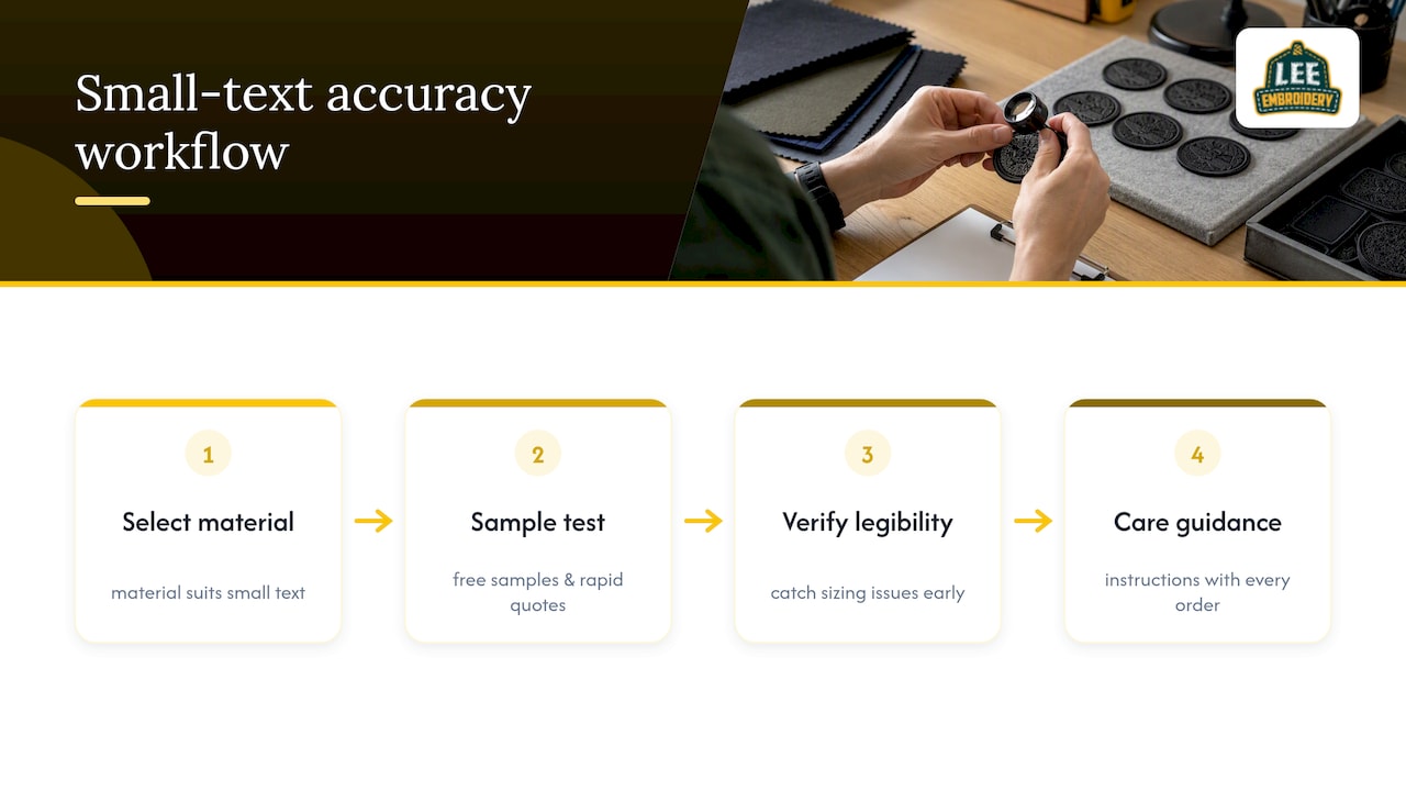
We specialize in custom patch manufacturing across embroidered, woven, chenille, printed, PVC, and leather options, which means we’re not forcing every design through a single process that may not fit. When a customer needs small text to actually read, choosing the right base material matters as much as the digitizing itself.
We offer complimentary samples and a rapid quote turnaround specifically so you can test small lettering before committing to a bulk order. That sample step catches sizing or legibility problems early, long before they become a costly reprint. We also provide care guidance with every order to help patches stay legible and intact through normal washing and wear, backed by a focus on durable materials and craftsmanship that holds up over time.
A Few Rules I Always Follow for Tiny Text
If there’s one rule that covers most of what matters here, it’s this: respect the minimums, match your thread and backing to the fabric, and never skip the sample. Those three things prevent almost every small-text failure I’ve seen in patch design.
My two priorities, in order: always get a physical sample before a full run, since a screen preview can’t show you sinkage or thread pickup issues. Then match thread weight and tackdown to your fabric choice rather than defaulting to whatever a template suggests. Everything else is secondary to getting those two right.
— Bilal
Get Small Text Right With a Free Sample From Us
We make it simple to test small lettering before you commit to a full order. Send us your art file with text converted to outlines, your preferred thread weight if you have one, and the fabric or backing you’re targeting, and we’ll turn around a quote fast along with a complimentary sample so you can check legibility in hand before placing a larger order.

Here’s what to include when you reach out:
- Your vector art file with text already converted to outlines
- The exact letter height and stroke width you’re aiming for
- The fabric or garment the patch will attach to
- Your preferred backing (sew-on, iron-on, peel-and-stick, or Velcro)
Start with our embroidery digitizing service to get your art production-ready, or head to our custom patches page to request your free sample and quote today.
FAQ
What font is used for patches?
Condensed or geometric sans-serif fonts with bold, even strokes tend to work best for embroidered patches, since they digitize cleanly at small sizes. Decorative, script, or serif fonts with fine details often blur once stitched.
How to embroider small text?
Small text embroiders best with a 60-weight thread for lettering around 4 to 5 millimeters, or a 75-weight thread for micro lettering near 3 millimeters, according to AMANN’s thread guidance. Keep strokes at or above roughly 0.6 millimeters, connect letters to reduce trims, and always test with a physical sample first.
What is a small patch?
A small patch generally refers to a compact design, often used on caps, lapels, or left-chest placements, where fine detail and small text have to fit within limited space. Size expectations shift depending on the production method, since embroidered, woven, and printed patches each handle tiny detail differently.
What is the smallest font size for embroidery?
Industry minimums suggest roughly 5 to 5.5 millimeters for all-caps lettering and about 6.2 millimeters for mixed-case text, according to small lettering guidance. Going smaller is possible with finer thread and simplified letterforms, but legibility and fabric choice both start working against you below those heights.
Sources
- How to create small embroidery designs | AMANN Knowledge Hub
- Small Lettering Guide – Part 1
- Small embroidery fonts: how to get best results | Embroidery Legacy