Yes, you can order patches matched to your Pantone (PMS) colors. But “matched” means something different on a patch than it does on paper. A patch is built from thread, rubber or ink, not from the ink formula Pantone prints in its guides. A good manufacturer picks the closest thread or mixes the closest PVC color, shows you the result, and records the choice so the next order looks the same.
This guide explains how that works, where color shifts creep in, and what to send your patch maker so your brand red looks like your brand red.
TL;DR
- Send Pantone numbers (for example PMS 186 C) with your artwork. Thread and PVC are matched to the closest available color, so confirm it on a physical sample.
- Each patch type reproduces color differently. Woven and PVC patches can get very close. Embroidery is limited by thread shades. Printed patches behave more like ink.
- Color drift between batches is real. Keep the same thread or color specification on file for every reorder.
- Home improvement paint counters cannot match Pantone to thread or fabric. Paint matching is a different process.
- A free sample is the cheapest way to avoid a reprint.
Table of Contents
- What “Pantone matching” means for a patch
- How each patch type handles color
- How close is close enough? Understanding Delta E
- Why the same patch can look different on the next order
- What to send your patch maker
- Why home improvement paint counters won’t help
- Our perspective: the sample beats the swatch book
- Special cases: baby apparel, uniforms and resale
- Get a matched sample from Lee Embroidery
- A short checklist before you approve
- FAQ
- Sources
What “Pantone matching” means for a patch
The Pantone Matching System is a numbered library of standardized colors. Brands use it so a logo looks the same on a sign, a box and a shirt. Pantone describes its colors and tools as a bridge between digital design and physical production, and it updates its libraries regularly.
The catch is that every material shifts color in its own way. A guide on PMS matching for promotional products puts it plainly: PMS exists so brand colors reproduce identically everywhere, yet every substrate and decoration method changes the result. Thread has sheen. Rubber is opaque and glossy or matte. Twill background fabric shows through between stitches.
So when you ask for a Pantone match on a patch, what you are really asking for is:
- The closest thread, PVC color or ink to your PMS number.
- A way to check it against your reference before the full run.
- A record, so the same specification is used next time.
How each patch type handles color
The patch you choose changes how close you can get. Here is a practical comparison.
| Patch type | How color is made | Matching approach | Watch out for |
|---|---|---|---|
| Embroidered | Pre-dyed thread in fixed shades | Pick the nearest thread to each PMS number | Thread sheen makes colors read slightly different than flat ink |
| Woven | Fine dyed threads woven into a flat face | Nearest thread per color, good for small detail | Very fine gradients are limited by the threads used |
| PVC rubber | Colored PVC compound | Color is mixed to a reference | Light colors over dark ones can need extra layers |
| Printed | Ink printed on fabric | Best for photos and gradients | Printed colors can shift under different lighting |
| Leather | Natural material, debossed or color-filled | Color fill matched to the reference | Leather’s own tone changes how a fill looks |
| Chenille | Looped yarn on felt or twill | Nearest yarn color | Texture softens and deepens color |
If your brand color is non-negotiable, such as a specific corporate blue, the material choice matters as much as the PMS number. If you are still choosing between types, our comparison of woven and embroidered patches and our PVC versus embroidered guide cover the trade-offs beyond color.
How close is close enough? Understanding Delta E
Color professionals measure the gap between a target and the real thing with a number called Delta E. According to the PMS matching guide, a Delta E under 1.0 is generally imperceptible to the human eye, while a value between 2.0 and 3.0 is noticeable on close comparison but acceptable for most commercial branding.
What does that mean for you?
- Side by side with a Pantone chip under good light, you may see a small difference. That is normal for thread and rubber.
- On a jacket sleeve or a cap, seen on its own, most people will not notice a gap in that 2 to 3 range.
- If a color pair is critical, for example a logo with two close blues, ask to see the sample next to your reference, not in isolation.
You rarely need a spectrophotometer for patches. You need an honest look at a physical sample in daylight and under the lighting where the patch will actually be seen.
Why the same patch can look different on the next order
This is the problem that costs people the most money. You love the first batch, reorder six months later, and the red looks a shade off.
A healthcare uniform color-matching article makes the point that color drift between production batches is a reality, and that the fix is process: assign specific thread inventory to a digitized file once, and use that same specification for every later order. Having a Pantone reference alone does not guarantee consistency.
In practice, that means:
- Keep your approved sample. Store it somewhere dark and dry. It is your real reference.
- Ask for the thread or color codes used. Put them in your brand file next to the PMS number.
- Quote that specification on every reorder, instead of just “same as last time.”
- Replace your Pantone guide when it ages. Pantone says its guides are refreshed and, per the research, professionals commonly replace printed guides every 12 to 18 months because colors can fade. An old chip makes a poor reference.
For more on thread itself, our post on embroidery thread types explains weights and what they do to the finished look.
What to send your patch maker
A clean brief takes a day off the process and removes most surprises.
- Vector artwork (AI, EPS, SVG or a high-resolution PDF). Flat color areas make matching easier.
- Pantone numbers with the suffix (C for coated, U for uncoated). PMS 186 C and PMS 186 U are not the same color on paper, so say which one your brand guide means.
- Size and placement. Small text and thin lines limit how many colors can fit.
- Patch type, border and backing. Merrowed or laser-cut border, sew-on, iron-on, peel-and-stick or Velcro.
- Quantity and deadline.
- Your physical reference, if you have one, and a note on where the patch will be seen: outdoors, under stage lights, on dark fabric.
If your artwork is a raster file or a photo, ask for it to be converted to an embroidery-ready file first. That is what digitizing does, and it is where the color-to-thread decisions get made.
Why home improvement paint counters won’t help
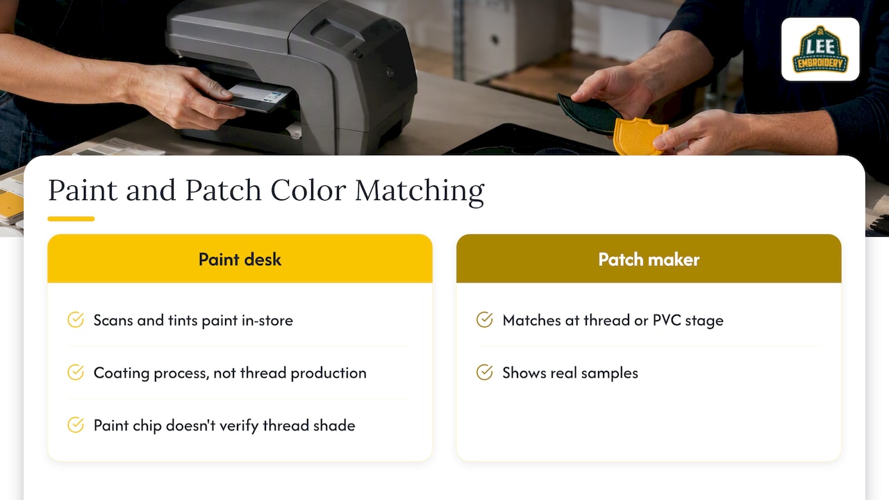
A common search is whether a big-box paint desk can match a Pantone color. They can match paint. Sherwin-Williams explains its color matching as in-store scanning and tinting of paint. That is a coating process. It cannot produce thread, yarn or dyed fabric, and a paint chip that matches your PMS number says nothing about how thread reads in the same shade.
For patches, the match happens at the thread or PVC stage, with a manufacturer who can show you real samples.
Our perspective: the sample beats the swatch book
We make embroidered, woven, PVC, leather, chenille and printed patches, and we have one rule about color: do not trust a screen or a chart alone. A monitor lights color from behind. A Pantone chip is ink on paper. A patch is thread or rubber catching light at an angle. Three different things, all called the same color.
What we tell customers is simple. Give us your PMS numbers and your artwork. Look at a free sample. Approve it, or tell us what feels off and we adjust. Then keep that approved version as your standard.
The mistakes we see are rarely about thread quality. They are about missing information: no C or U suffix, artwork with colors that were never specified, or a reorder placed from memory. Slow down for ten minutes at the start and you save the cost of a reprint.
Our color-matching page walks through how sampling prevents reprints.
— Bilal
Special cases: baby apparel, uniforms and resale
Some buyers have extra constraints, and color is only one of them.
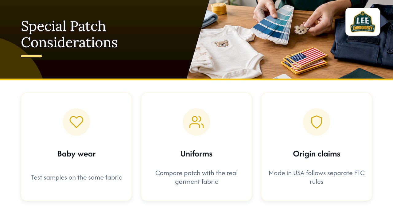
Baby apparel shops and online sellers. Pastels are the hardest colors to match on thread, because small shifts are easy to see on white or cream fabric. Ask for the sample on the same fabric you will sell. Material safety matters here too, so read our guide to safe baby patch materials before you order for infant wear.
Uniforms and team gear. Patches sit next to dyed garments, and the garment’s own color will not match your PMS exactly. Put the patch against the real fabric when you evaluate it. Wash behavior also affects how colors age, which our patch washing instructions cover.
Made in USA claims. If you plan to label finished goods that carry patches, the FTC takes origin claims seriously. Its textile labeling guidance notes that the fiber disclosure rules apply to fibers in yarns, fabrics and clothing, and not to non-fibrous parts such as plastic or leather. Origin claims follow separate Made in USA rules, so check them with the FTC or a qualified advisor before printing a label.
Get a matched sample from Lee Embroidery
If you have a Pantone number and a design, we make it easy to see the result before you commit. We offer complimentary samples, quick quote turnaround and free shipping. Custom patches start from $99, and our custom patches page shows the full range of types, shapes, borders and backings.
Need your logo converted for embroidery first? Our digitizing service is $10 for a left chest design, $10 for a cap and from $30 for a jacket back. Ready to start? Request your free quote and tell us your PMS numbers. You can also read what others say on our customer reviews page.
A short checklist before you approve
- Did you specify C or U for each Pantone number?
- Is the sample viewed in daylight and in the lighting where the patch will live?
- Did you hold it against the real garment or bag?
- Are thread or color codes saved with the order?
- Is your own Pantone guide recent enough to trust?
- Have you stored the approved sample for reorders?
For a broader overview of options before you choose, see the ultimate guide to custom patches.
FAQ
How do I get a Pantone color match on a patch?
Send your artwork along with the Pantone numbers, including the C or U suffix. The manufacturer chooses the closest thread, yarn or PVC color for each number. Then check a physical sample against your reference before approving the full order.
Can Home Depot or Sherwin-Williams match Pantone for patches?
No. Their color matching is built for paint, which is scanned and tinted in store. It does not produce thread or dyed fabric, so for patches you need a manufacturer that works with thread and PVC colors.
Will my patch match my Pantone chip exactly?
Usually not perfectly, because thread, rubber and ink are different materials from the printed chip. A Delta E of 2.0 to 3.0 is generally noticeable only on close comparison and is acceptable for most commercial branding. Sampling shows you whether the result meets your standard.
How do I keep colors consistent across reorders?
Keep your approved sample and the thread or color specification from the first order, and reference it on every reorder. Batch drift is a known issue, and a recorded specification is the best protection against it.
Sources
- Pantone Connect
- PMS Colour Matching for Promo: Why It Fails and the Fix
- Pantone Color Matching for Healthcare Uniforms (2026), Merchloop
- How to Match Paint Colors, Sherwin-Williams
- Threading Your Way Through the Labeling Requirements Under the Textile and Wool Acts, FTC